Showing posts with label Tim Holtz. Show all posts

Monday, May 4, 2015

Masculine Cards to Share

Here are some masculine cards that I created recently. Most of my cards were "Pinspired". I love Pinterest.

Father's Day Card with barb wire embossing and StampinUp! designer series paper.

Here a Father's Day card I made for my son because he's such an awesome Daddy. The embossing folder is from Tim Holtz. Many of the other embellishments were lingering in my stash.

This Father's Day card was for my hubby. The stamps are StampinUp! I created the blotchy rectangle by inking up a clear plastic stamp block with Tim Holtz "old paper" ink. I love the way it turned out.

I dislike needing sympathy cards so often, but it's so nice to be able to bless the family with a beautiful handmade card. This one was created with the Mighty Oak die set from Papertreyink.
Thanks for stopping by my blog today. Enjoy your week!

Thursday, August 30, 2012

Easy masculine birthday cards & Just Because

Making cards is always a quick, crafty fix for me. I can get out just enough of my "stuff" to be dangerous without making too much of a mess!

My boys celebrated their 22nd and 20th birthdays last week. I enjoy making cards for them, because they are so special to me. I know that guys don't always appreciate handmade cards, and they may not keep them for very long, but that's okay with me. My cards are an expression of my love. Making them + giving them = JOY for me.

The Dude card was fun and easy. I cut out the surfboards from some paper in my stash. The embossing folder is T. Holtz. I went over it lightly with yellow stamp pad. The sand layers were hand cut and distress inked along the edges. The birthday sentiment is StampinUp.

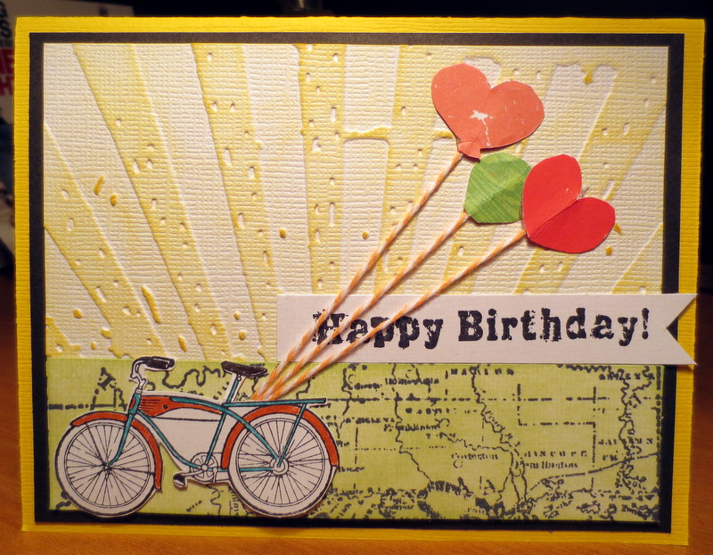
As you can see I use this T. Holtz embossing folder a lot, because it's got that great distressing. Perfect for a grungy guy look. The bike and sentiment are SU. The balloons were hand cut...This would have been a great time for some tiny punches. =) Imagine...something that I don't have? I did try something new here. Instead of stamping my map (Glitz) on green paper, I used StazOn ink to stamp the map, and then lightly went over the whole map with a light green ink. Easy...not sure why I haven't done that before.

 This super easy card is for my Momma. I had some new photos to send to her and needed a card to go along with. Super easy...5 minutes. Pretty self explanatory. The felt flower is left over from baby shower decorations. I like the texture and the simplicity of this. She'll love it...Especially when she sees the beautiful pics of her Great-Grandaughter inside. =)

Looking forward to a nice 3 day weekend!! Hope yours is delightful! Thanks for stopping by my blog today.

Tuesday, August 9, 2011

Double cruise layout - "San Pedro Claver"

We are having such beautiful weather this evening. I have all the doors and windows open. What a nice cool summer breeze!
Today I have one more double cruise layout of our time in Columbia on our 25th wedding anniversary. This layout features the pictures we took at the San Pedro Claver church. Another example of the beautiful old architecture in Cartagena, Columbia. This was one of the last stops on our city tour.

I forgot to write down the supplies used here. I believe the paper is Tim Holtz, along with the masking tape.

The title font is Plantin School book. You can see that I ripped the top layer of paper to give it an old look and curled it up on the right edge.

I used these chipboard accents (from Me & My Big Ideas) because they reminded me of the shapes in the architecture of the church.  

I have a few more Columbia layouts that I need to finish up. This weekend I scrapped and put those aside to work on a new project...I'm re-doing my parent's wedding portraits. My parents are now living in a full time care residence. We've sold their condo and finished going through the remainder of their things weekend before last. We even tackled the pictures. I brought home many photo treasures of my boys, my grandparents before they were married, and my parents wedding album which fell apart in my hands when I started leafing through it....So, I have a new project and I'm pretty excited about it. I'll share some of these layouts later this week.

Thanks for stopping by! Anybody working on a vintage wedding album?? I'd love to hear about it. Just leave a comment. It's always nice to hear from you!

Friday, June 3, 2011

More Graduation cards

Happy Friday! My dear friend and I are on our way to a weekend scrap retreat. We've had it on the calendar for months and it is finally here!! Before I leave, I wanted to get a quick post out to share some more graduation cards with you.

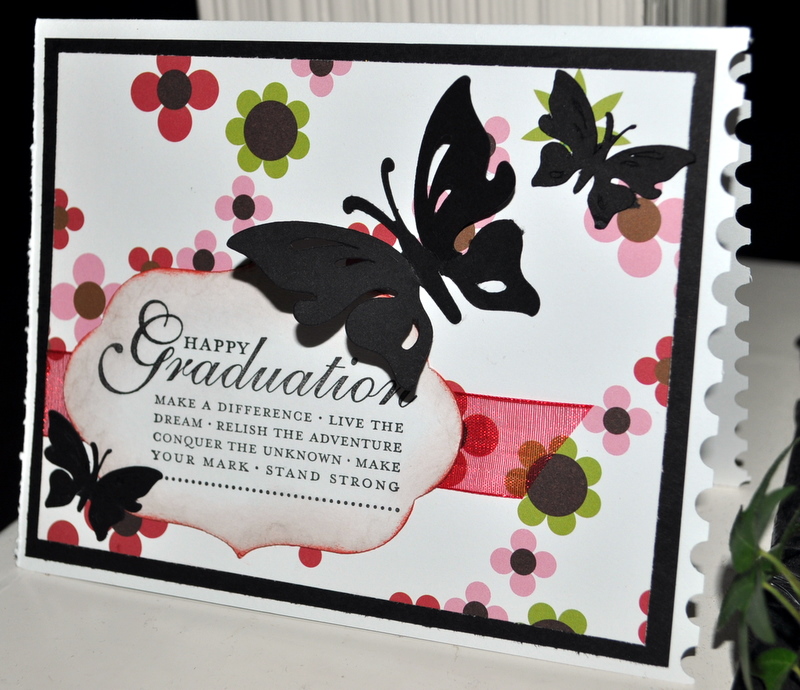
First, a few for the girl graduates. Loved the black butterflies!! These first three cards were inspired by cards I saw Splitcoaststampers. The sentiment is StampinUp! and patterned paper is some mysterious paper that I found in my stash...I love it when that happens...LOL. I used the postage stamp border punch on the edge for a little special detail. The butterfly is from the Indie cartridge (Cricut). I made four and I wish I had made more because I'd kind of like to keep one for myself. =)


This is so simple, but I love the way it turned out. The picture doesn't really do it justice. I used Coredinations cardstock in a very light pink, but it looks kind of gray here. Cut some black script paper with Plaintin Schoolbook cartridge as well as the adorable little flowers, and topped the flowers with tiny gemstones. Easy...so I made four of them for the speical young ladies that we know who are graduating this year.

I love the colors in this boys card! I used a lot of Kraft, black, and red. The map paper is Great Escapes from an 8x8 stack I found some time ago. I just sliced both of them in half and made four of this style of card. The sentiments are Tim Holtz. The cute little car is Graphically Speaking cartridge. I added "Class of 2011" by hand for some additional detail in the left corner. This was the first time I made an inside cut with my trimmer. It was pretty easily actually so I may keep this in mind and make more frames for my cards and layouts.  

These are sample thank you cards for my son to send after his party. I get inspired by logos and advertisements that I see and especially those combining fonts and numbers into an eye-catching design. I sat down and did this in WordArt in about 15 minutes. I don't pretend to be a designer, but I knew what I wanted and like the way it turned out. I was jumping up and down when I realized that my Creative Memories small square punch just happened to fit perfectly around the logo. I was able to easily frame it using the larger square punch and blue paper...very helpful when you're making multiples! The embossing folder is, of course, Tim Holtz! I have most of his new distress embossing folders and am a huge fan! 

Same idea here, but simpler. Only one layer and used a different (my favorite) Tim Holtz distress embossing folder right on the base of the card. Quicker and Jacob liked it the best...Lucky me! 

Come back Sunday for the Father's Day cards that I made! Have a wonderful weekend. Thanks for checking out my blog today!!!

Monday, May 2, 2011

Birthday cards to share today

Thanks for stopping by my blog today. A few weeks ago I was able to get inspired to make a few birthday cards for friends and family. I thought I would share those with you today on this rainy Monday in Fort Wayne.

The dry embossing folder is Tim Holtz. I inked over the pale aqua paper with a couple different shades of ink to really bring out the texture of the dry embossing. The heart stamp is SU. I spritzed it to give it a frosty shine which is a little hard to see here. Then, added a couple of tiny pearls here and there.

This card is the same Tim Holtz embossing distress folder with the same inking method. However, I added a little bit of VersaMark here and there and sprinkled on some bronze embossing powder so it would cling and used the heat gun. The bird (SU) is also heat embossed with the bronze powder. I trimmed around it and popped it up. Using the same ribbon and papers, helped me speed up the process a little. I can sometimes get slowed down in the process of choosing the paper. When I find something that works together well, I try to at least use the remainder of the paper and make up another card while I've got it out.

This last one is my favorite. My nephew had a birthday, and I thought it would be nice to come up with a "guy" card for him. The emobssing folder is from Tim Holtz. I've been dying to use this folder for a few monthsand hadn't come up with anything until now. I was pretty excited with the way it turned out. The sunburst look is pretty trendy right now. I've noticed it in a lot of advertisements and brochures. I tend to see a scrapbook page or card in almost everything I see...Guess that's where I draw my inspiration. The patterned paper is theTeen Angst collection. Just  a little corner of it to grunge it up a little. The silver metallic dots helped finish it off nicely. Hope he liked it!

Thanks for stopping by! Have a lovely evening!!

Tuesday, March 1, 2011

Three birthday layouts to share - "Flicks", "Happy Birthday Boys", "Make a Wish"

Please explain how March has come so quickly? While I'm ready for spring to come, it seems the months are flying by. Happy March 1st!

Since it's been a week since I've posted, I want to share three birthday layouts with you!! It seems all I've worked on lately is birthday pics, so there will be more birthday stuff later. Our boys share the same big day...August 22 (1990 and 1992). So, August is a big month for us, and then my birthday follows in September. My husband celebrated his 50th in January. Needless to say, I put my new "Birthday Bash" cricut cartridge to work lately. =)

Here we go. First up is "Happy Birthday Boys". The pictures were taken during our family celebration in our back yard. The weather was perfect. A pretty simple layout...I had fun with the banner!


Next up is my layout "Make a Wish". These pictures are from the following weekend when they had their friends over to celebrate their birthday with them. It's so nice that they have many of the same friends. That's what happens when you're close in age and go to the same small school... Everybody is friends with everybody. Kind of nice!

I was nervous about all of the bright colors going together, but I LOVE the way it turned out. My two guys are on the right side page.


Last, but not least (actually my fave of the three) is "Flicks". After the food and cake, they watched a movie in our backyard!!! We hung a white sheet on the fence and borrowed some equipment from our church. It was pretty cool. Jacob loves to do this and I'm sure it will be an annual event as long as he's living with us...which better be a long time!=) I changed the pictures to black and white, and turned it into a vintage-look layout. The "Flicks" icon is from the Nifty Fifties cartridge. Love this!!! I used it alot for my hubbies birthday layouts. You'll see those in future posts.


Lovin all of the Tim Holtz papers and filmstrip here. I may change my film reel. It doesn't look quite right and I've since thought of a better way to make one. Anyway, I love the vintage look and I hope that it inspires you in some way. Check back later for even more birthday layouts!!

Thursday, January 27, 2011

A few easy cards

It's snowing again here in Fort Wayne, Indiana. The snow is very pretty and starting to accumulate and add to the few inches already on the ground. January is almost over already, so spring can't be too far away now. The older I get, the less I enjoy the cold, frozen tundra at this time of year.

A few weeks ago, I put a couple of cards together one evening. Since I haven't had much scrappy time lately, the cards are a nice little crafty "fix" for me. Thought I'd share these with you today.

First card is a Sympathy card. The image and sentiment stamps are both SU, and I used the Tim Holtz "Woodgrain" texture fade embossing folder. I am on a major TH embossing folder craze right now! He has some additional new folders coming out in a few months. I have almost every one of them and can't wait to buy the new ones! The designs are great and they make such a nice deep impression. I like the way the olive velvet ribbon ties it all together.


The second card is a baby card for some friends. The sentiment stamp is SU, and the image is from an acrylic set that has all kinds of images pertaining to babies. If somebody wants to know the brand, I can find it for you. I used an eyelet border punch on striped paper for another layer of color. The nifty striped canvas ribbon topped it off nicely attached with a staples.

I am super excited for tomorrow night! I'll be scrapping with some friends all Friday evening, and again all day on Saturday. Can't wait to share it all with you here later. ENJOY your weekend!