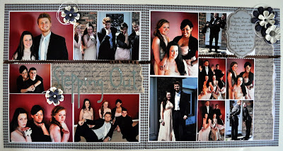
So, today, I'm sharing the layout of Jacob's prom pictures. These kids are all such good friends. They had fun posing for their scrapbook obsessive Moms. If you are new to my blog, Jacob is the tall one with the lighter hair (upper left). The other boy belongs to my best scrapping buddy.

You'll have to look closely to see the title "Stepping Out". I blinged it up with some little pearls so it would show up a bit more.

Here's the right side of the layout. I use a lot of wallet size pictures. It really helps me fit more on the page. I tried something different with the flowers. I cut a length of white scrappers floss and wound it loosely around the floweer petals after attaching them to the page...The white really seemed to make the navy flowers pop. It was pretty simple, but I liked the way it makes the flowers just look a little more whispy. Is that a word? You'll have to check out the middle picture on this page where the guys have their hands up. Every time the boys put their hands down on their dates' shoulders, the girls would warn them not to mess up their hair. So this is the "don't touch the hair" picture. Too funny! I love the Diva expressions on the girls faces too.

Here's a closeup of the flowers and the journalling. Can you see the dry embossing on the bottom layer of the journalling spot? I inked the edges too for a vintage look. The flower centers are SU antique brads. I tried to keep the bling to a minimum since it will go in a boy's album....He can live with a few flowers, though, right?
Thanks for looking! Hope you are able to enjoy the sunshine today! It's in the 90's here today. I was hoping for a little more spring before the dog days of summer. It's much better than rain, though, so I will try to keep the whining to a minimum. =)


Classy page. The title alpha arrangement is very nice too!
ReplyDeleteI love the layout! I'm still trying to figure out how to post on blogger accounts. Hopefully this works!
ReplyDelete