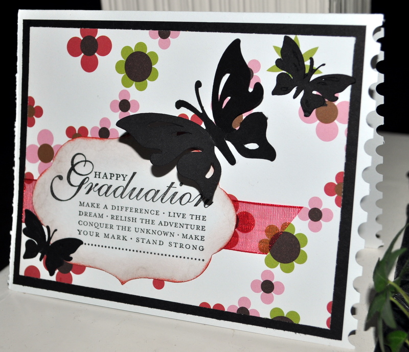
First, a few for the girl graduates. Loved the black butterflies!! These first three cards were inspired by cards I saw Splitcoaststampers. The sentiment is StampinUp! and patterned paper is some mysterious paper that I found in my stash...I love it when that happens...LOL. I used the postage stamp border punch on the edge for a little special detail. The butterfly is from the Indie cartridge (Cricut). I made four and I wish I had made more because I'd kind of like to keep one for myself. =)
This is so simple, but I love the way it turned out. The picture doesn't really do it justice. I used Coredinations cardstock in a very light pink, but it looks kind of gray here. Cut some black script paper with Plaintin Schoolbook cartridge as well as the adorable little flowers, and topped the flowers with tiny gemstones. Easy...so I made four of them for the speical young ladies that we know who are graduating this year.

I love the colors in this boys card! I used a lot of Kraft, black, and red. The map paper is Great Escapes from an 8x8 stack I found some time ago. I just sliced both of them in half and made four of this style of card. The sentiments are Tim Holtz. The cute little car is Graphically Speaking cartridge. I added "Class of 2011" by hand for some additional detail in the left corner. This was the first time I made an inside cut with my trimmer. It was pretty easily actually so I may keep this in mind and make more frames for my cards and layouts.

These are sample thank you cards for my son to send after his party. I get inspired by logos and advertisements that I see and especially those combining fonts and numbers into an eye-catching design. I sat down and did this in WordArt in about 15 minutes. I don't pretend to be a designer, but I knew what I wanted and like the way it turned out. I was jumping up and down when I realized that my Creative Memories small square punch just happened to fit perfectly around the logo. I was able to easily frame it using the larger square punch and blue paper...very helpful when you're making multiples! The embossing folder is, of course, Tim Holtz! I have most of his new distress embossing folders and am a huge fan!

Same idea here, but simpler. Only one layer and used a different (my favorite) Tim Holtz distress embossing folder right on the base of the card. Quicker and Jacob liked it the best...Lucky me!

Come back Sunday for the Father's Day cards that I made! Have a wonderful weekend. Thanks for checking out my blog today!!!
great cards! The paper on the fist one is American Crafts by the way, and I love how you've used it!
ReplyDeleteLove the range of cards you created! I recognize a few papers I have in my collection so I might have to borrow a few of your wonderful ideas.
ReplyDelete