Today I have two layouts from the Adirondack Mountains in New York to share with you. Whiteface Mountain is in Wilmington, NY near Lake Placid. I was there at a class updating my insurance designation and we were so blessed to be able to do some sight-seeing!!
The first layout is mainly Basic Grey. The papers seemed to have a "royal" flare and worked well to highlight the cool stone castle on top of the mountain.
The diecuts were all cut with the Art Philosophy cartridge. The gemstones on each Fleur di lis helped them pop off the page along with a little bit of Tim Holtz pumice stone ink around the edges. I love my husband sitting in this old chair made of birchwood inside the castle. This place was too cool! The key in the bottom right hand corner is also cut with Art Philosophy. I covered it with Glossy Accents to make it shiny and a little bit 3D.
Here are the pages side by side.
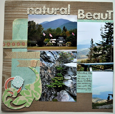
This next layout highlights some of the great views that we saw on our way up and back down the mountain. I have plenty more layouts to show you from this trip last September. I'm about done with the mountain layouts, and will be starting my pictures from Niagara Falls, next time I get a chance.
Here's the quaint building that welcomes you to the beautiful scenic drive up the mountain. They told us it would be a bit foggy up there for a little while, but that it would clear, and they were exactly right. The chipboard and letters were purchased and made it a quick layout. I added some Tim Holtz masking tape and a little bit of ribbon.
Here are the two pages side by side.
Thanks for stoping by my blog today. I need to photograph some cool snow layouts that I did recently, and hope to post those next time. Until then, enjoy your week!!


Love both your sets of pages! What beautiful pictures too:)~Kim
ReplyDelete